
Sitelevel
Product design / Financial operationsEvery location has a story.
Make the numbers explain it.
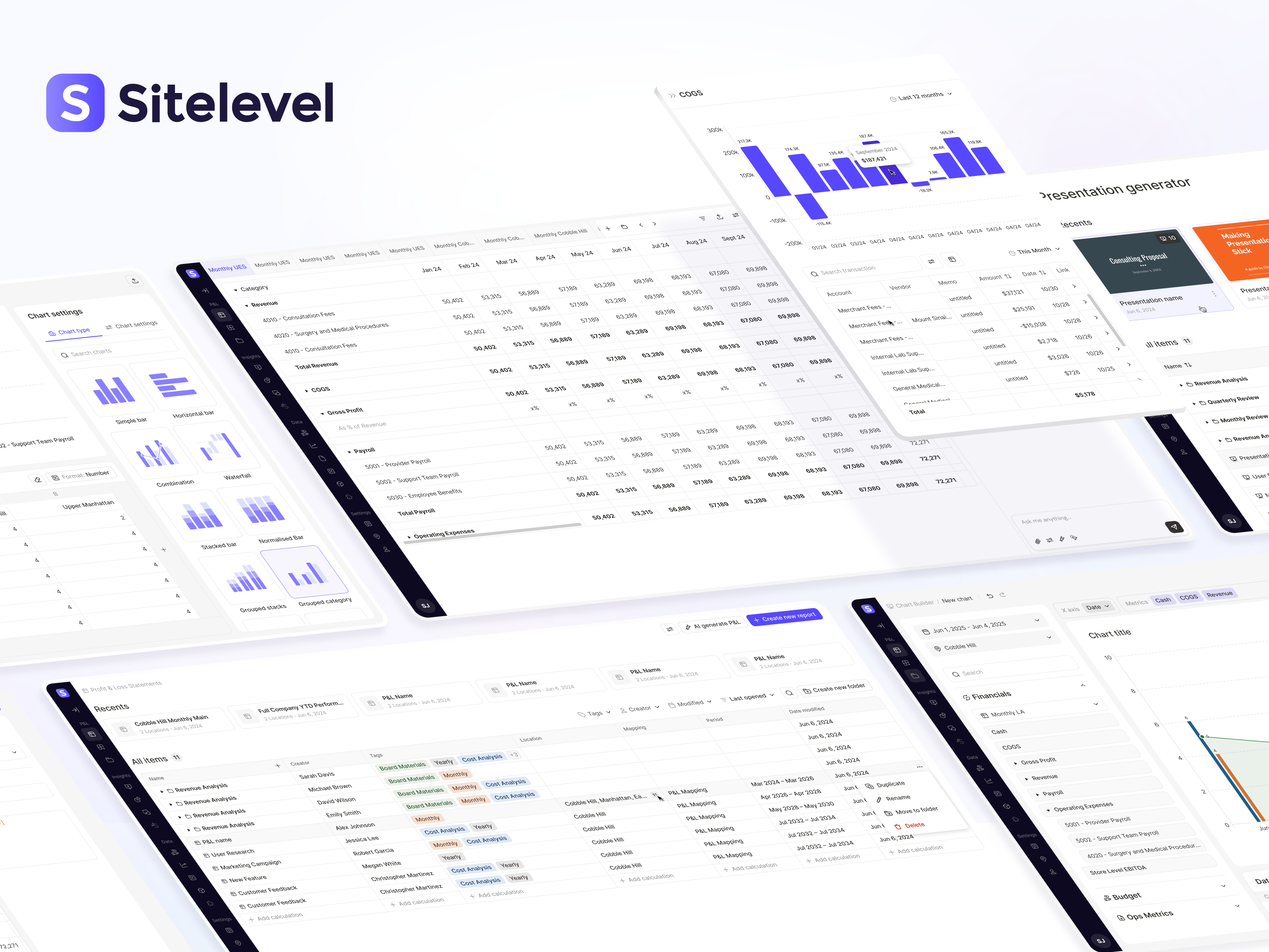
For a business with many locations, every financial question carries a second one: which site, which period, and compared with what? We designed Sitelevel’s reporting workflows to keep that context intact, from the first imported file to the presentation a leadership team uses to make decisions.
- Product
- Financial reporting & analysis
- Built for
- Finance teams managing multiple locations
- Explore
- Visit Sitelevel ↗
The design challenge
One reporting process.
Many different ways to look at the business.
A finance team may need a consolidated view for leadership, a location‑level P&L for an operator, and a budget comparison for the next planning meeting. Building each output separately repeats the work and makes it harder to know whether everyone is looking at the same thing.
We designed around three recurring choices: the metric, the location, and the period. Keeping those choices explicit gives people a consistent way to build, compare, and investigate financial views. A report, a chart, and a slide can serve different audiences while staying connected to the same business context.
01 / Design the next reporting cycle, too
Build the report once.
Let the period move forward.
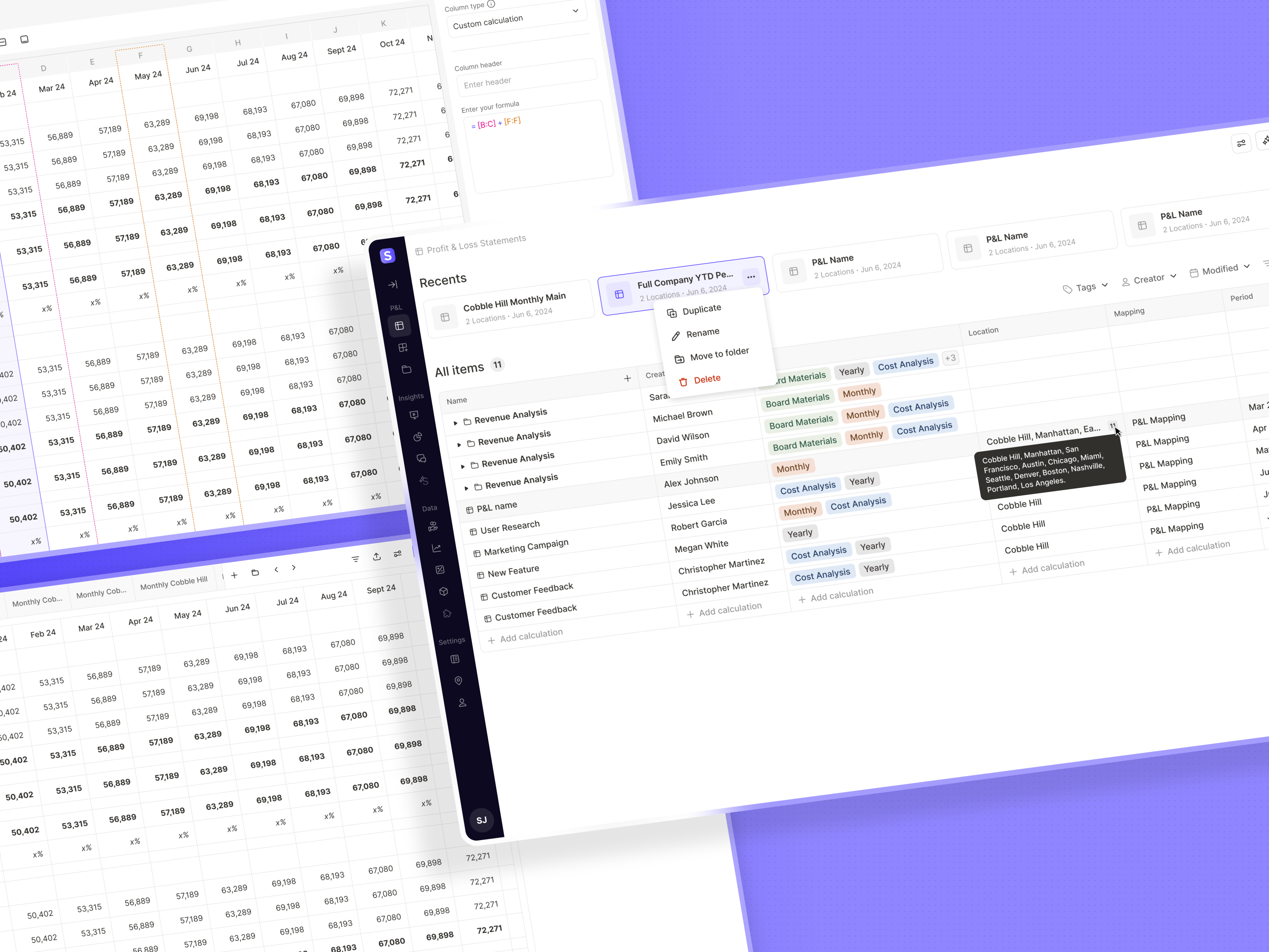
We separated a quick start from a fully custom report. A mapped P&L begins with a reporting structure, location, and period; the builder lets a finance specialist combine actuals, budget rows, operating metrics, and calculations. Bulk actions support both ways people think about the business: one metric across many sites, or many metrics for one site. Adaptive periods such as year‑to‑date and trailing twelve months carry the structure into the next cycle. In the builder, those columns are visibly grouped so their automatic behavior can be understood and edited.
02 / Make a financial answer inspectable
The total is the starting point.
The explanation is one level deeper.
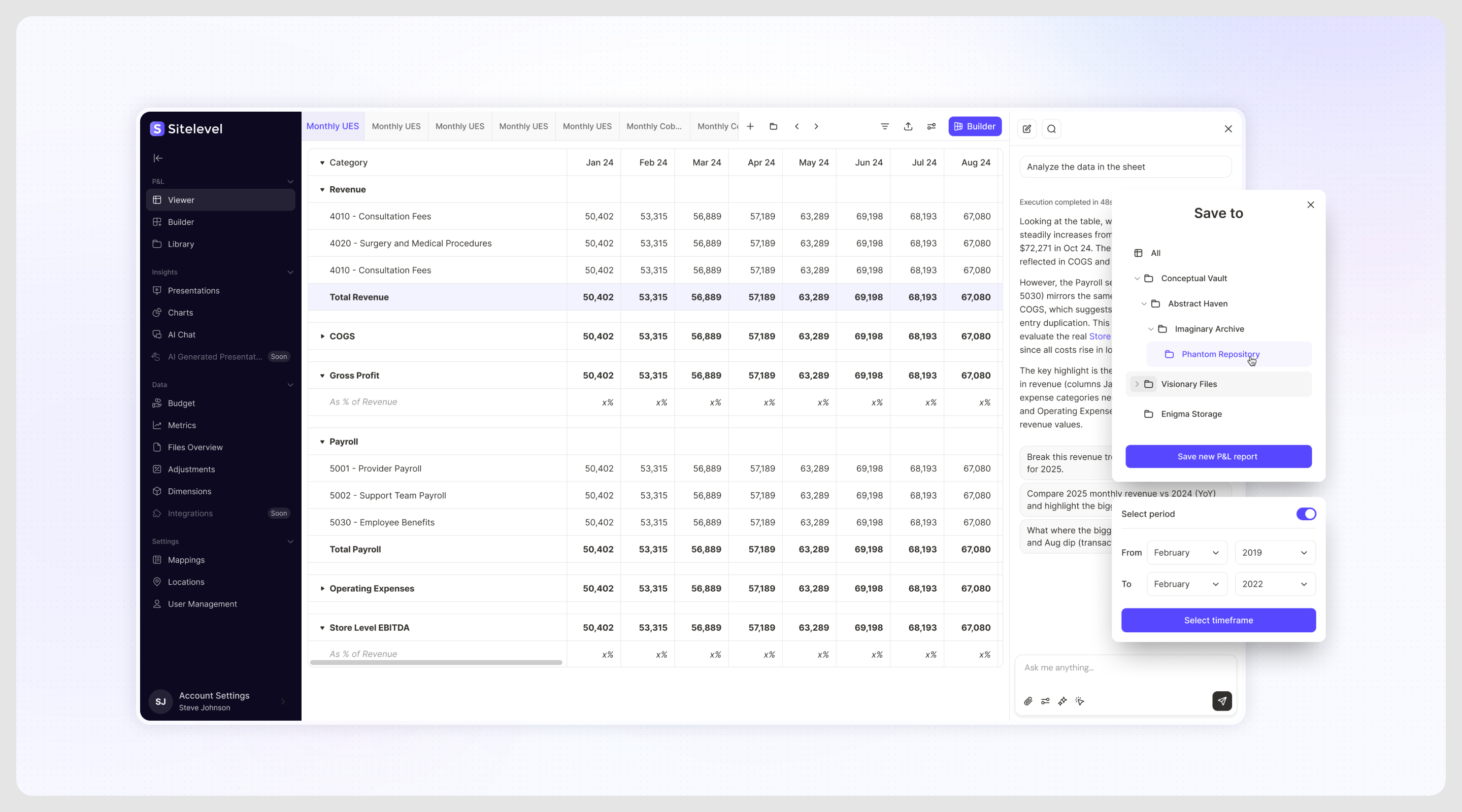
A variance is a reason to investigate. We designed drill‑down as an overlay: open a metric, inspect its transactions and trend, then return to the report without losing the wider comparison. The time period remains adjustable inside that investigation. Contextual AI chat gives people another way to ask questions about their data, alongside the direct route to the underlying records. We also separated building from viewing, so readers can explore a report without needing the full set of editing controls.
03 / Meet finance teams where their data already lives
An uploaded spreadsheet
needs meaning before it becomes a budget.
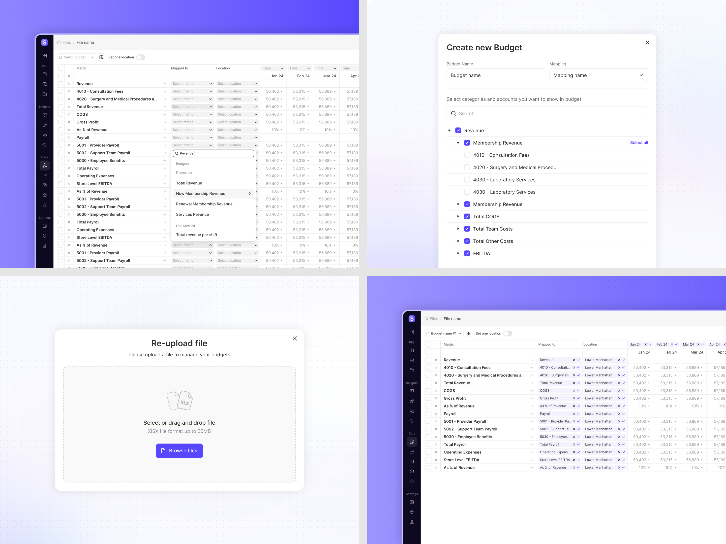
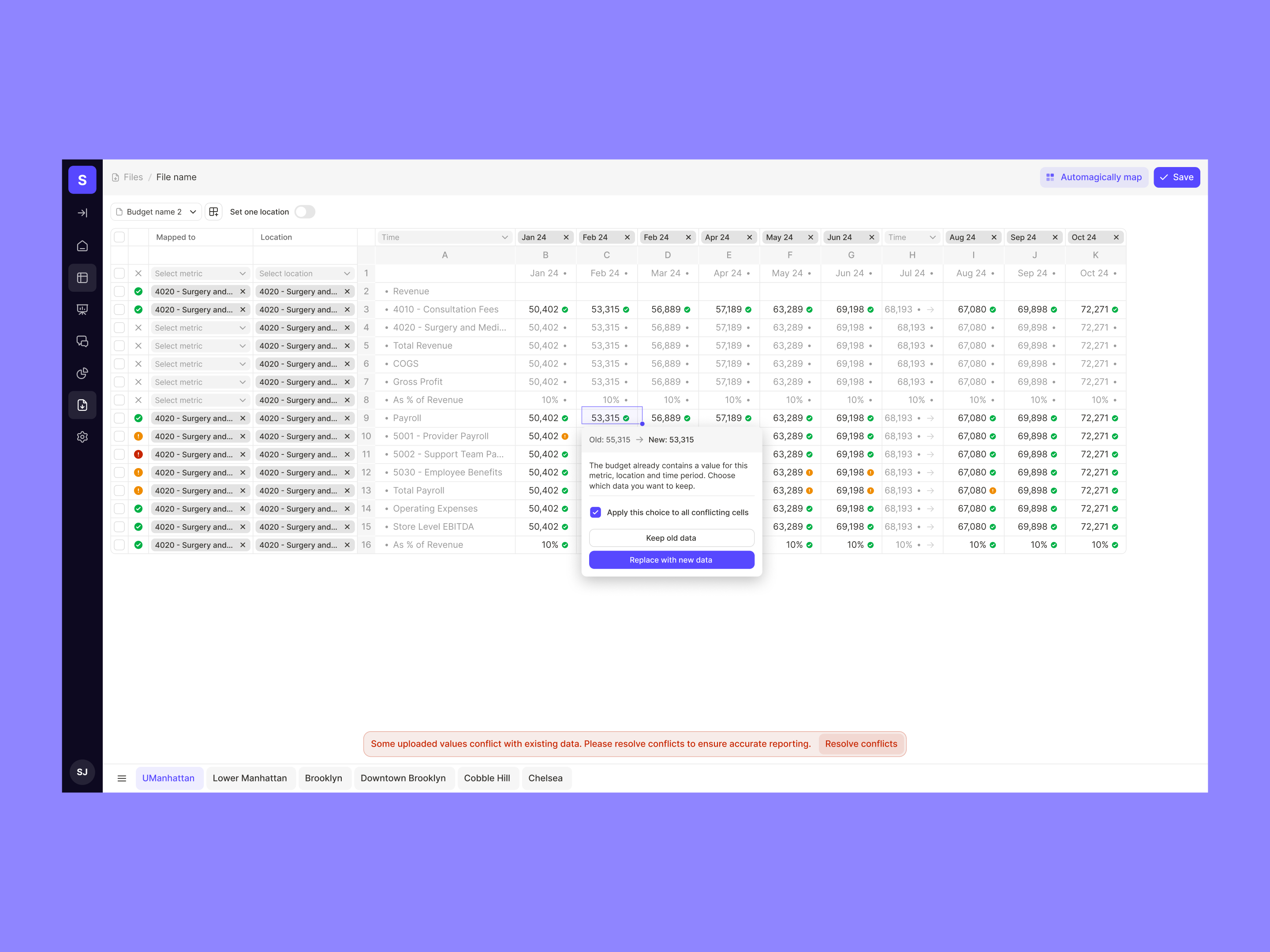
Some planning data arrives through integrations; some still lives in Excel. We designed budget setup and file mapping as distinct steps. First, the user chooses the financial and operating metrics the budget should contain. Then each imported row is connected to a metric and a location, and each column to a period. A location can be set for an entire sheet, mappings applied to multiple rows, and periods filled forward. Automatic mapping offers a shortcut while leaving the interpretation visible and editable.
04 / Treat exceptions as part of the main flow
Make the conflict explicit.
Let the person decide what survives.
Fast import is only useful if the team can trust the result. We accounted for invalid values, duplicate assignments, and data that conflicts with an existing budget. The interface identifies the affected values and gives the user a choice: retain the existing data or replace it. Repeated issues can be resolved together, while mapping settings can be reused across similar files and sheets. The workflow handles the messy second upload as deliberately as the clean first one.
05 / Carry the analysis into the room
A presentation should inherit
the work already done.
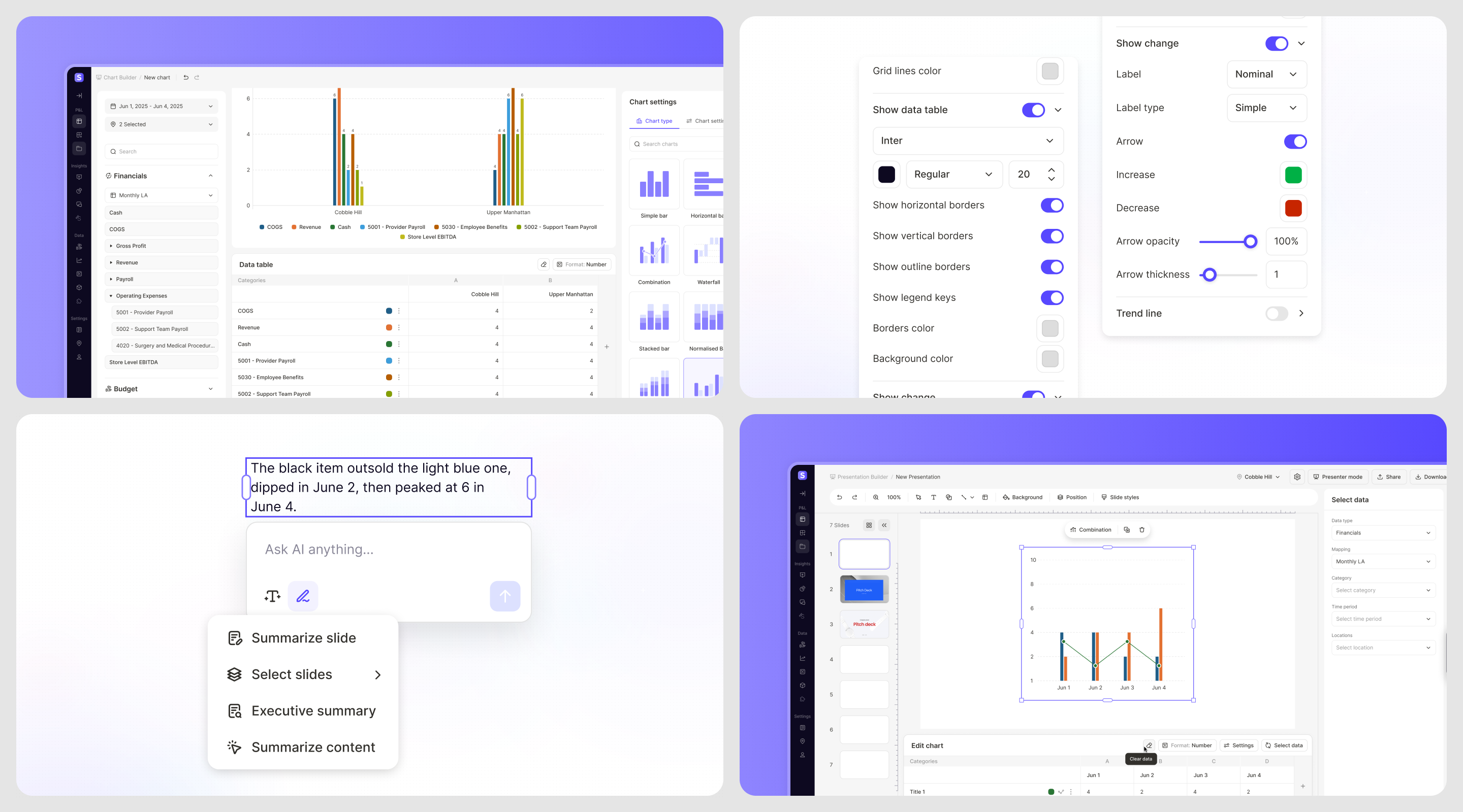
We used familiar slide‑editing patterns and refined the toolbar through several iterations. A presentation can carry default location, period, and brand settings, so each new chart or table starts with the right context. Brand kits make colors and typography reusable. The finance team can focus on explaining performance instead of rebuilding the same visual rules for every location.
For AI‑generated presentations, we designed an outline review before slide generation. Users can edit the content, change slide types, reorder the story, and answer clarifying questions before committing to a deck. Progress remains visible during generation, and the result opens in the presentation builder. Automation speeds up preparation while leaving the financial narrative in the user’s hands.
06 / Business outcome
More locations.
The same financial clarity.
Our design work connected data setup, reporting, investigation, and presentation into a repeatable workflow. The practical value is in what carries forward: a reporting structure can serve another site, an adaptive period can serve the next month, and an analysis can become an editable presentation. Finance teams get a way to explain performance without rebuilding the process around every question.
- Repeatable reporting
- Reuse structures across locations and periods
- Verifiable numbers
- Move from a metric to its underlying transactions
- Editable outputs
- Reports, charts & slides
Today, Sitelevel publicly offers adaptive reporting, transaction‑level investigation, and financial presentations for multi‑unit businesses. Its customer feedback points to the same need behind our work: making financial understanding available to the people running each location.
Explore Sitelevel ↗What Sitelevel’s customers say about the product
“It’s like cloning my best FP&A hire and seating one next to every operator in the company.”
CFO, Concierge Medical
Customer attribution published by Sitelevel